Microsoft Excel is a very useful data management tool used widely by almost every organization today to analyze and interpret data. A Graph in Excel is a design tool that helps us visualize data. Excel has a variety of graphs and charts that can be used to represent data in different ways. This article will help you understand the different types of graphs available in Excel, and learn how to make a graph in Excel.
What is a Graph in Excel?
In simple terms, a graph is a visual element that represents data in a worksheet. You will be able to analyze the data more efficiently by looking at a graph in Excel rather than numbers in a dataset. Excel covers a wide range of graphs that you can use to represent your data. Creating a graph in Excel is easy. The graph below depicts the sum of active COVID cases that are grouped by WHO region.
Reasons to Use Graph in Excel
Graphs in Excel simplify complex data, making it easier to understand at a glance. Instead of navigating through numbers, a graph visually highlights key trends and comparisons. Learning how to create a chart in Excel or how to create graphs from Excel data can help convey your message clearly and ensure your audience quickly grasps essential insights. Next, let us learn types of graphs and how to make a graph in excel.Types of Graphs in Excel
Excel has most of the common graphs that are used for statistics. The types of graphs in Excel include:
1. Bar/Column Graphs
A bar graph shows information about two or more groups. Bar graphs are mainly used to make comparisons across a range.
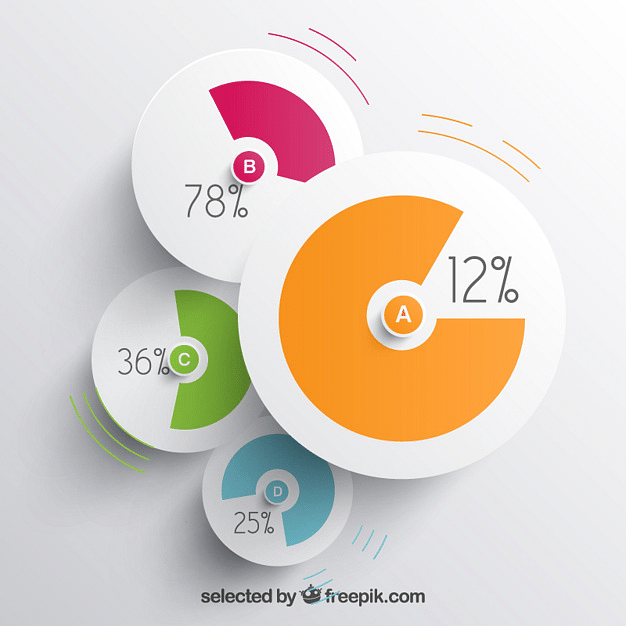
2. Pie Graphs
A pie chart is nothing but a circular graph representing data in the form of a pie/circle. It is divided into different sections, each one representing a proportion of the whole.
3. Line Graphs
A line graph is formed by connecting a series of values/data points using straight lines. A line graph can be used when you want to check whether the values are increasing or decreasing over some time.
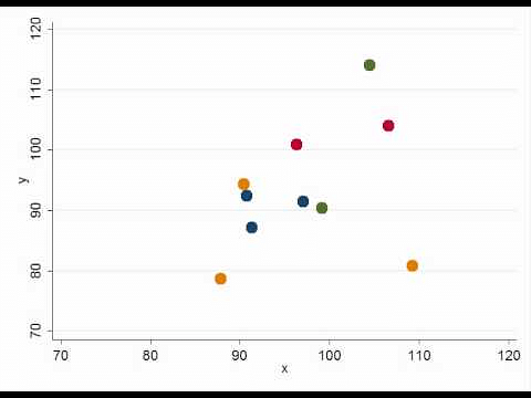
4. Scatter Plot
A scatter plot, also called a coordinate graph, uses dots to represent the data values for two different variables, one on each axis. This graph is used to find a pattern/ relationship between two sets of data.
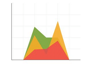
5. Area Chart
An area chart depicts the change of two or more data points over time. They are similar to the line charts, except the area charts are filled with color below the line. This chart is useful to visualize the area of various series relative to each other.
Before you make a graph in Excel, it is important to first cleanse your data. The next section will cover a few Data Cleaning techniques.
6. The New and Improved Bar Graph (Now Called a Clustered Bar Graph)
A clustered bar graph in Excel displays data horizontally, making it simple to compare different series side by side. This chart is great for seeing the differences between categories. For example, you can use a clustered bar graph to compare sales figures for different products across several stores. By doing this, you can quickly spot which products are performing better in different locations, helping you make informed decisions about inventory and sales strategies.
7. Ditto for Column Charts (Renamed Clustered Column Charts) Clustered column
Clustered column charts show data vertically with each column representing a different data series. This type of chart is perfect for comparing items and seeing their rankings. For example, if you want to compare the performance of different sales teams across various states, a clustered column chart can clearly show which team is leading in each state. The taller columns make it easy to see which teams are performing best and which may need more support.
8. Radar Chart
Radar charts are used to compare multiple variables on a single chart, using a shape that connects various points. Each point represents a different variable, and the shape formed helps you see patterns and strengths. For example, you might use a radar chart to compare different candidates' skills across areas like leadership, communication, and problem-solving. This helps you see where each candidate excels and where they might need improvement.
9. Funnel Chart
Funnel charts are useful for visualizing how data moves through different stages of a process. The wide end represents the starting point, and the funnel narrows as it progresses. This chart is great for analyzing processes like sales pipelines. For example, a funnel chart can show how many leads move from initial contact to final sale, highlighting where the biggest drop-offs occur and helping you focus on improving those stages.
10. Histogram Chart
Histograms display data by grouping it into ranges and showing how frequently values fall into each range. This type of chart is useful for understanding distributions. For example, if you want to analyze the age range of your customers, a histogram can show how many customers fall into each age group. This helps you identify trends, such as a shift in the age demographics of your target audience.
11. Box and Whisker Chart
A box and whisker chart, or boxplot, summarizes data by showing its distribution and any outliers. It includes a box that represents the middle 50% of the data, with lines extending to show the range. This chart is useful for comparing different data sets. For instance, you could use a box and whisker chart to compare test scores across different schools, revealing variations in performance and highlighting any unusual results.
12. Pareto Chart
Pareto charts use both bars and a line to show the frequency of issues and their cumulative impact. This helps you identify which problems to tackle first for the most significant improvement. For example, if you’re analyzing customer complaints, a Pareto chart can show which issues are the most common and have the biggest impact, helping you prioritize your efforts to resolve them.
13. Surface Chart
Surface charts offer a three-dimensional view of data, showing how different variables interact. This type of chart helps identify optimal combinations of factors. For example, you could use a surface chart to analyze how varying price and advertising spend affect sales, revealing the best conditions for maximizing revenue.

Post a Comment